365 Days of Presentation Design
Over the past year, presentation design has been emphasized more than ever in my life. I use it every day: in class, in case competitions, and in the working world. As a marketing and design student, I have to realize how important it is to utilize your visuals properly when presenting.
This quarter I am enrolled in a business communications class that has been studying the most effective way to create a slide deck that aids your speech in presentation, and it got me thinking… Wouldn’t it be interesting to look at presentations I created merely one year ago and compare them to what I do now? I remember thinking they were pieces of art– far above the standard I was being held to. Looking back, I can only laugh at myself. It’s funny how the presentations I was once boasting about the quality of, are now a bit embarrassing. I remember getting numerous complements on my “eye for design” and the look of my presentation– but I think I have come pretty far. That being said, maybe one year from now I will look back at this post and think the same things. Guess we’ll have to wait and see.
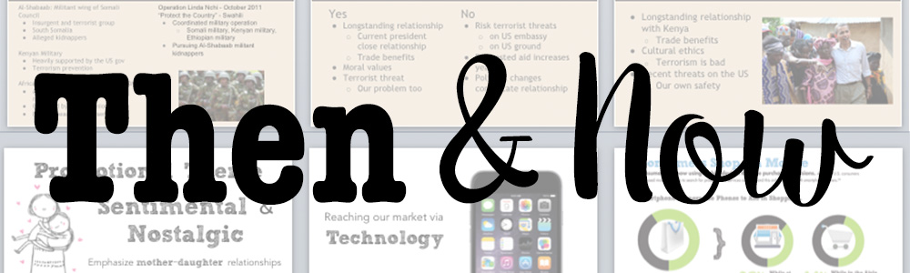
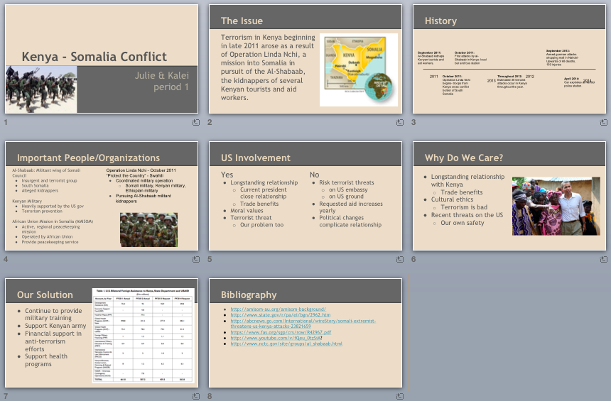
May, 2014. Exactly one year ago, I voluntarily put my name on this presentation for a government and politics class. Yuck.
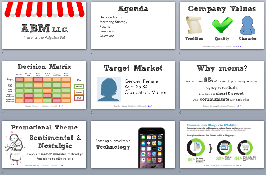
Now let’s fast forward to just a couple months ago in a case competition I did. Here’s a snapshot from that slide deck (but the full version can be found here). I realize this isn’t the holy grail of presentation design either, but I think we can all agree that it is a dramatic improvement. Much easier to follow, and less of a headache for both the presenter and the audience.
I have to say, the number one lesson I’ve learned: do not use blocks of texts in a PowerPoint slideshow. Really, just save it for the speaking portion of your presentation, or maybe even a handout, but there is no need to expect your audience to read a paragraph about the exact same thing you are trying to say out loud. People can only process one word loop at a time, so why make them choose between listening to you, and reading what you put in front of them?
Number two, no matter how minuscule the presentation is, avoid templates. I have seen my fair share of PowerPoint presentations, and trust me, I can recognize a Microsoft Office template from a mile away. I have seen them used in every single way, shape, and form (yet none successfully). Every presentation I have ever been proud of has been a custom template. I’ve learned how to design consistent presentations from scratch, and I can’t tell you how important it is in a professional or academic setting.
The third that that shouts out to me when comparing these two presentations– photos should be professional, and used efficiently. Maybe this is more of a matter of opinion, but the way you use photos in a slideshow is game-changing. As you can see, I did use them in both decks, but they create a much more cohesive look in the more recent slides. I integrate the photos into the background and the theme of my slides, rather than just cropping them and sticking them in a corner surrounded by text. There are different ways to integrate photos, but I am a big fan of transparent backgrounds and asymmetrical placement.
Finally, don’t be fooled by the default of bullet points. Bullet points rarely help you get your point across in a presentation. More often than not, they’ll lead to too much text, and distract from what you’re saying. I find it much easier to keep text to a minimum, and emphasize the important words or phrases with varying size/font/color. That way, if the audience reads anything from the slide, it’ll be exactly what you want them to see.
It’s really amazing how much I have come to learn in my few months at University. These four tips hardly make a dent on the things I’ve learned, but I do think they are a great start to improving slide design. Even in the professional world of presentations, I see the same chunky text slides over-and-over again. The concept strong visuals that support your speech, rather than just repeat it, is something I hope professionals from every industry learns to implement in their work. I am excited to see where this next year of learning takes me, and hopefully keep on improving.