Brand Profile: iMac Evolution
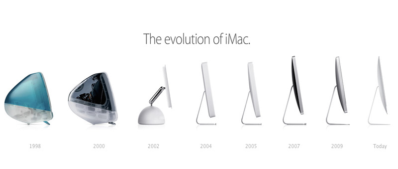
Apple is iconic for their revolutionary designs, and their constant innovation. The iMac has played a big part in the technology revolution since the original release in 1998. I recently stumbled across this “evolution of iMac” timeline that Apple released alongside their 2012 line, and thought it would be interesting to compare the advertising techniques used in each of the large changes.
The 1998 iMac was released originally in blue, and expanded to a series of bright colors capitalizing on the 90s trend that took over the fashion industry. Up until this point, trendy clothes were neutral, and computers were beige– without exception. When the fashion scene started brightening up, Apple made their entrance with the bright new “personalized” computers.
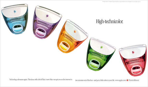
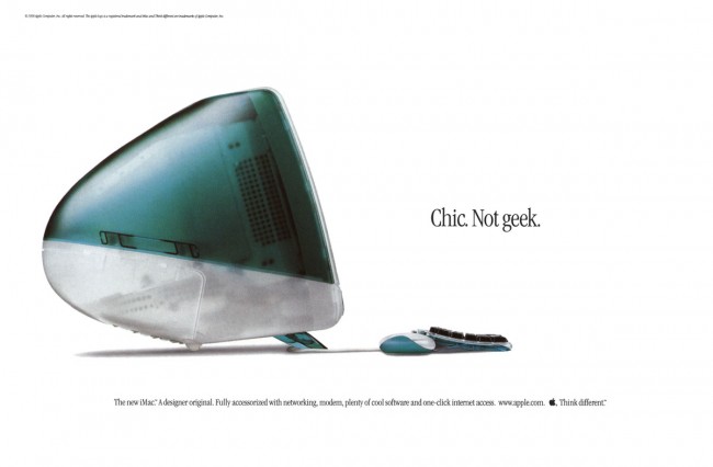
What better way to represent “think different” than a line of computers like no one had seen before. Suddenly computers were cool, which is exactly what they told their consumers in this next print ad.
The iMac G4 rolled around in 2002, once again changing the computer scene. What had been a staple design for the past 4 years was about to completely change. “The new iMac,” ads introduced. They were priming their customers for a whole new look to a beloved line of computers.
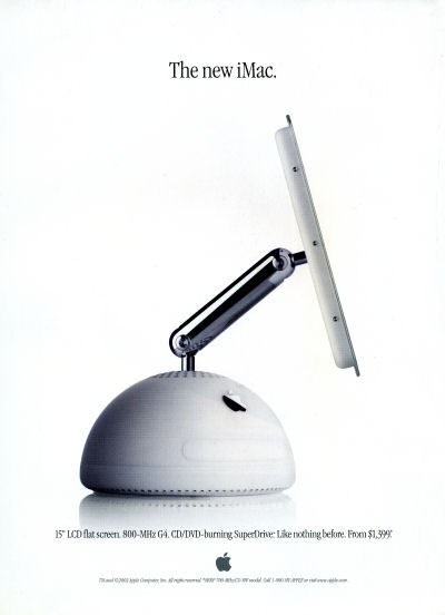
We know now that this lampshade style foreshadows the look of the current macs. A shape that was unrecognizable to computer-lovers of the time.
The G5 is starting to look familiar. The computer’s vitals were moved behind the screen, where they remain today, and Apple began to capitalize on the simplicity of the computer body.
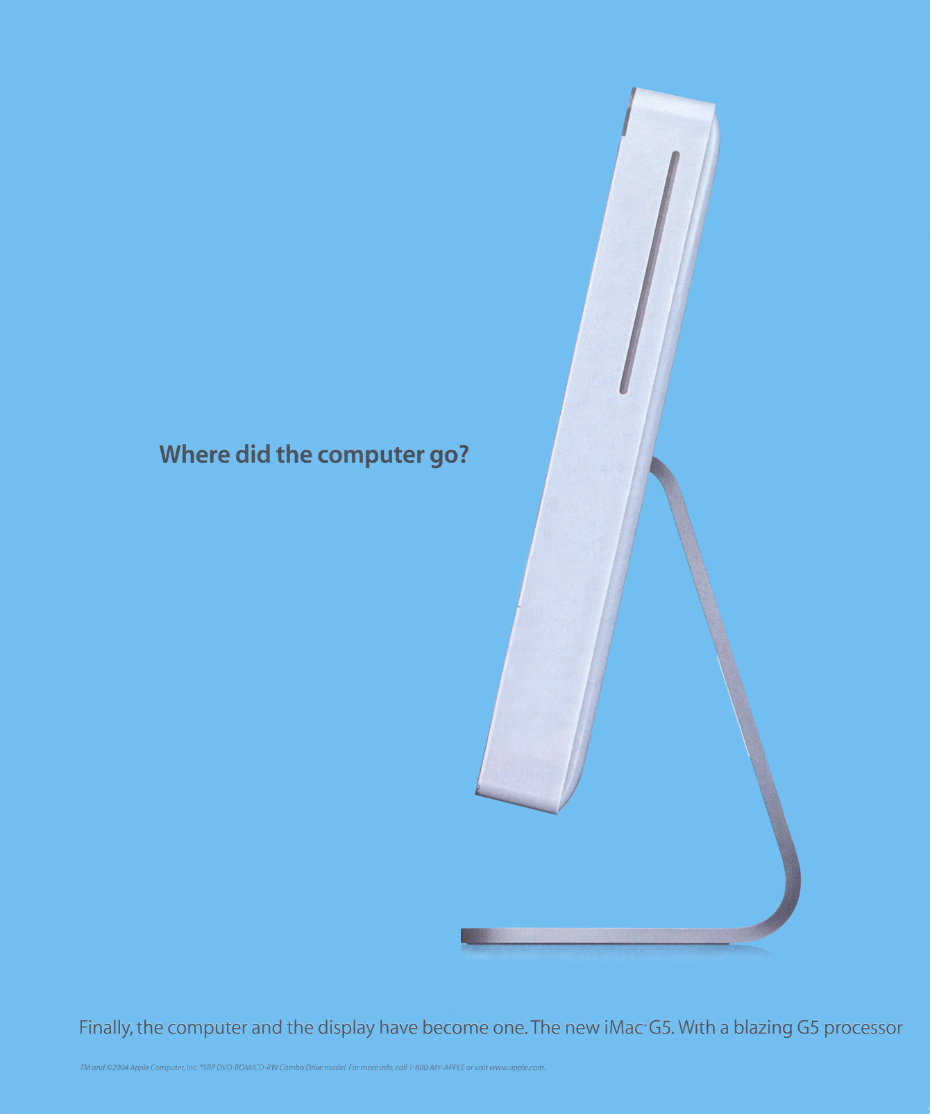
This ad is my personal favorite, “Where’d the computer go?”. The side view of the iMac was sleek, simplistic, and everything that Apple stood for. Unlike PC users, iMac owners didn’t have to worry about a monitor and the desktop being separated, or any excess wires and adapters. Things were made simple, and made very different.
The next few generations of iMacs echoed the same ideas of simplicity, getting thinner and thinner with every release. Here’s an ad from the 2012 release.
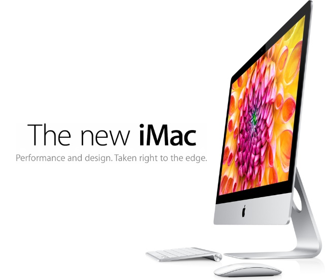
No gimmicks, just a photo and a brand statement that leaves technology-lovers lusting at the sight of it. The Apple we know today has a pull so powerful on the market there’s not much they need to say. It’s truly amazing how simple they’ve gone with their advertising techniques, and how effective it can still be. With the release of the 5K Retina Display iMacs, this is all that can be found as an “ad campaign”: 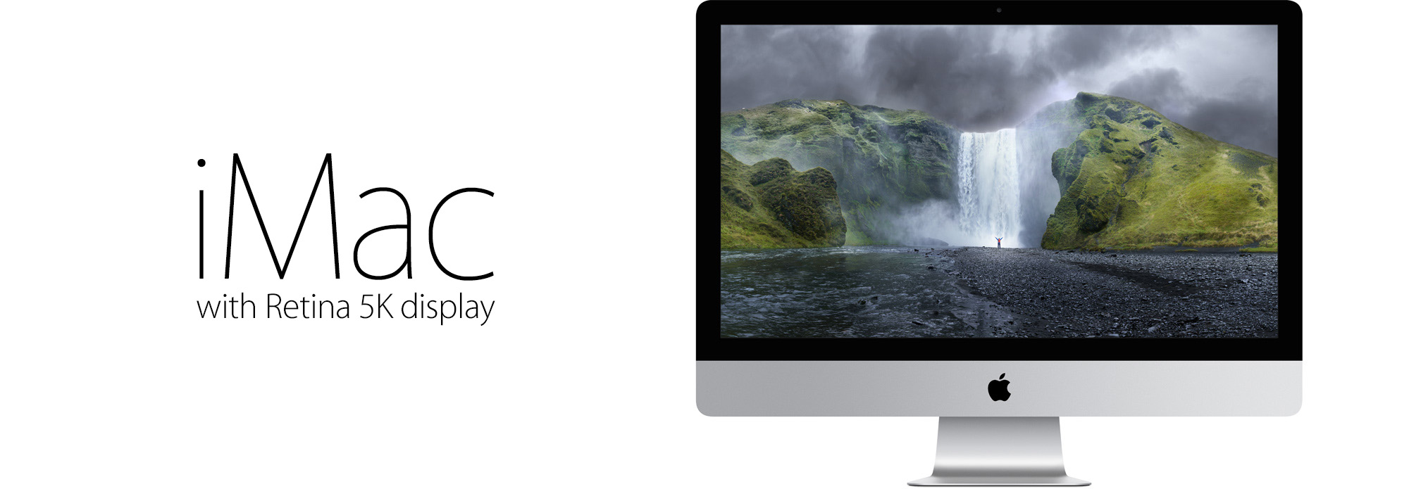
A photo, and the name of the product. What other company can pull of such a compelling ad with only those two elements?
When I see how far Apple has come over the past couple decades, I am appalled. What’s more than that, is I see at the same time, they haven’t had to come very far at all. Apple has always had an eye for brilliant simplistic design in their products, and in their branding.
I love the “evolution of iMac” image they created back in 2012, I think it truly tells the brand’s story in a matter of four words.


