The Website Design Evolution
Being interested in both marketing and design drives me to be constantly thinking about what will be visually appealing to my audience in the future– but what about in the past? I thought it would be interesting to compare a popular blogs from nine years ago to how those blogs look today, and analyze those changes.
I am a long-time reader of Mashable— They deliver articles about topics that I enjoy reading about, and over the past nine years, have climbed their way to blog-fame. Of course the clean blue and white tiles that come to mind when thinking about this blog weren’t always there.
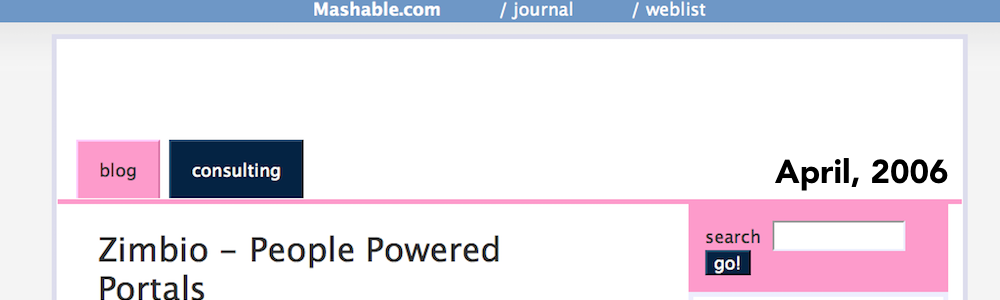
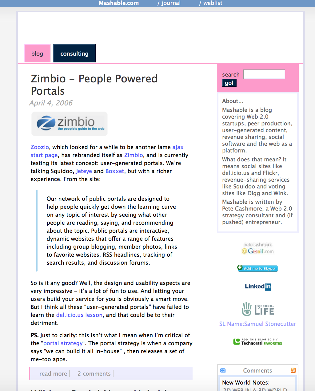
This screenshot was taken from one of the earliest points of Mashable existence: April 2006. Just over nine years ago, and the website design truly shows:
Now for the sake of direct comparison– here’s the Mashable homepage as it appears today (June, 2015):
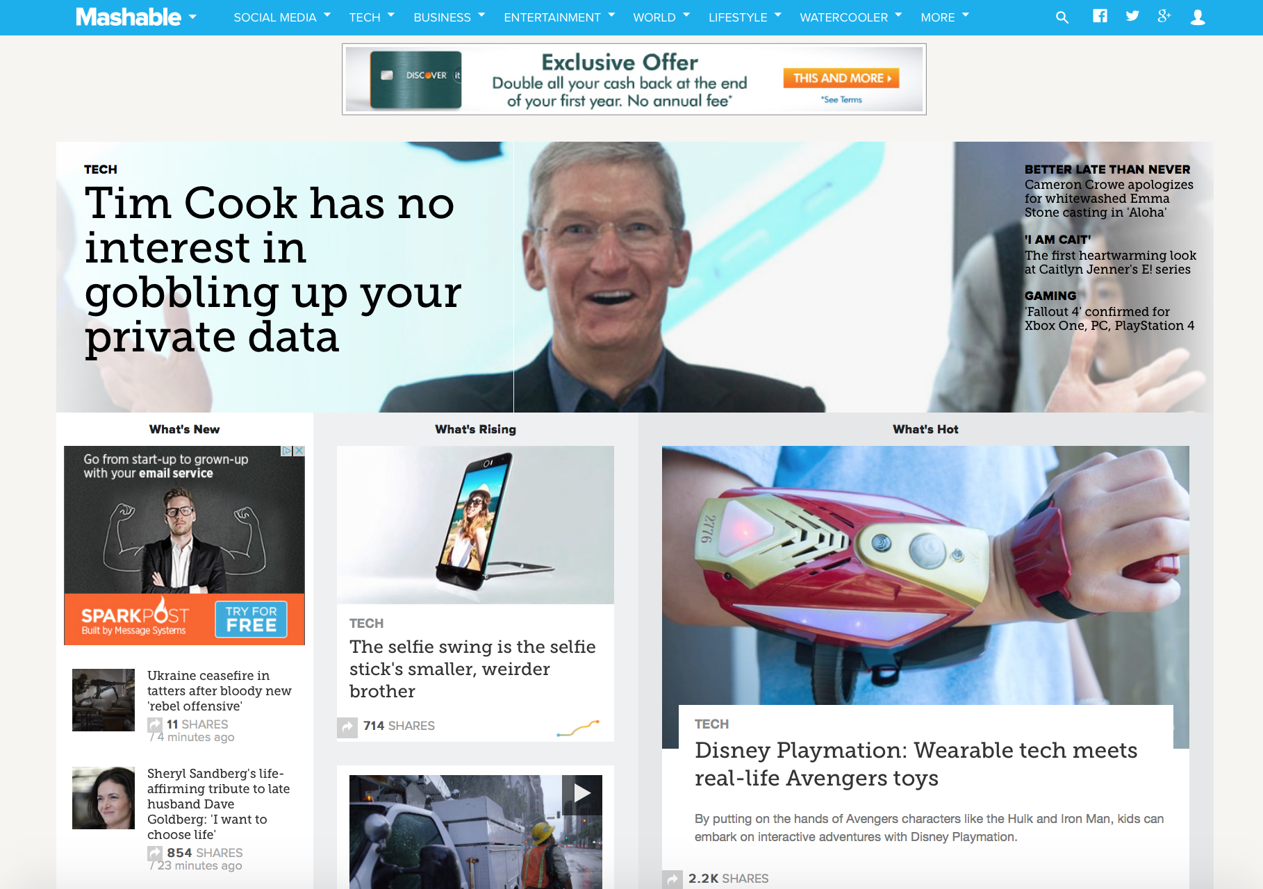
Nine years has made quite a difference. The mass audience of present-day Mashable speaks for itself– the design captures attention from people and drives interaction. So when I look at the difference between the two, a few main things jump out at me. More interestingly, these changes in the design of Mashable seem to hold true for nearly every website that has developed over the past decade.
- Less text, more visuals. Probably the first (and most offensive) thing I noticed about the 2006 Mashable homepage was the lack of images. The entire blog was focused around the text. As a blog, this isn’t completely irrational. Most blogs start out with a lot of text, but it just doesn’t get the same audience interaction as a website with compelling images and titles to seduce you into reading them. 2015 Mashable has mastered the art of paring photos and titles in order to get the most views.
- Fewer Photos, more videos. Really this change in the way of design can be summed up by saying that the more interactive a visual is, the better. We traded text for photos, and photos for videos. Each one getting more interaction from the audience than the last. Mashable capitalizes on its ability to deliver high quality videos and gain vitality from shares by those viewers.
- Tile Display. It wasn’t until the very end of 2012 that Mashable adopted the tiled look of articles, made famous by Pinterest back in 2010. Until this point, most online blogs followed a very similar blog display that focused on linearly displayed articles. Not to say that there’s anything wrong with a linear blog display, (I chose to create my blog in that way) but for such a massive site like Mashable, pushing out blogs multiple times per day, it’s great to be able to have a more interactive way to feed new content to users.
- Minimalism. “Less is more” is the new motto in the design world. Everything comes down to simplicity. This can be seen in the tiniest details of the two websites. If you look at the buttons on the 2006 version of the blog, you’ll see the embossment and shadow effect. These effects are typically offered as easy-to-apply functions on software such as the Microsoft Office Suite, but have been traded in by present-day designers for a more flat look to shapes and photos. It is quite uncommon to come across modern day designs with these design functions applied to them.
- Utilizing Scrolling. Blog posts of the past were about getting as many clicks from viewers as possible– after all, the more clicking, the more the viewer is seeing, right? Wrong. Clicking means nothing if a viewer is actually turned off by the extra step it takes to see more content. It’s very common to see blogs these days with an infinite scroller, rather than a “Page 1 2 3 4” function. Scrolling is more dynamic, and goes back to the “less is more” philosophy. It requires less action on the users’ part, but allows them to see just as much information (if not more).
So what have you noticed about the change in the way that people are designing? These are just a few of the changes seen from one blog that has gained a huge following over the past decade. It’s quite interesting how consistent the pattern is across the evolution of design in most popular blogs.
I encourage you to take a look at the WayBack Machine Internet Archive for yourself and play around with websites of the past and present, and really see the change in audience taste, as it progresses through time.