Easy Infographics.pptx
One of my summer projects for the internship is to create an infographic. To familiarize me with the Concur style, my manager sent me a couple examples of past infographics they’ve sent out– one in particular we really liked and hoped to mock the style of with my project.
After asking the creative department, we found out that it was actually Steve Thompson, VP of Business Operations who created it himself. In PowerPoint. He has no design background: just a great eye, and a knack for PowerPoint presentations. This is something I think a lot of people could benefit from, so here are some tips, tricks, and quick tutorial to create a professional looking infographic in PowerPoint (and even an example we created).
Tips from Steve, the PowerPoint Wizard:
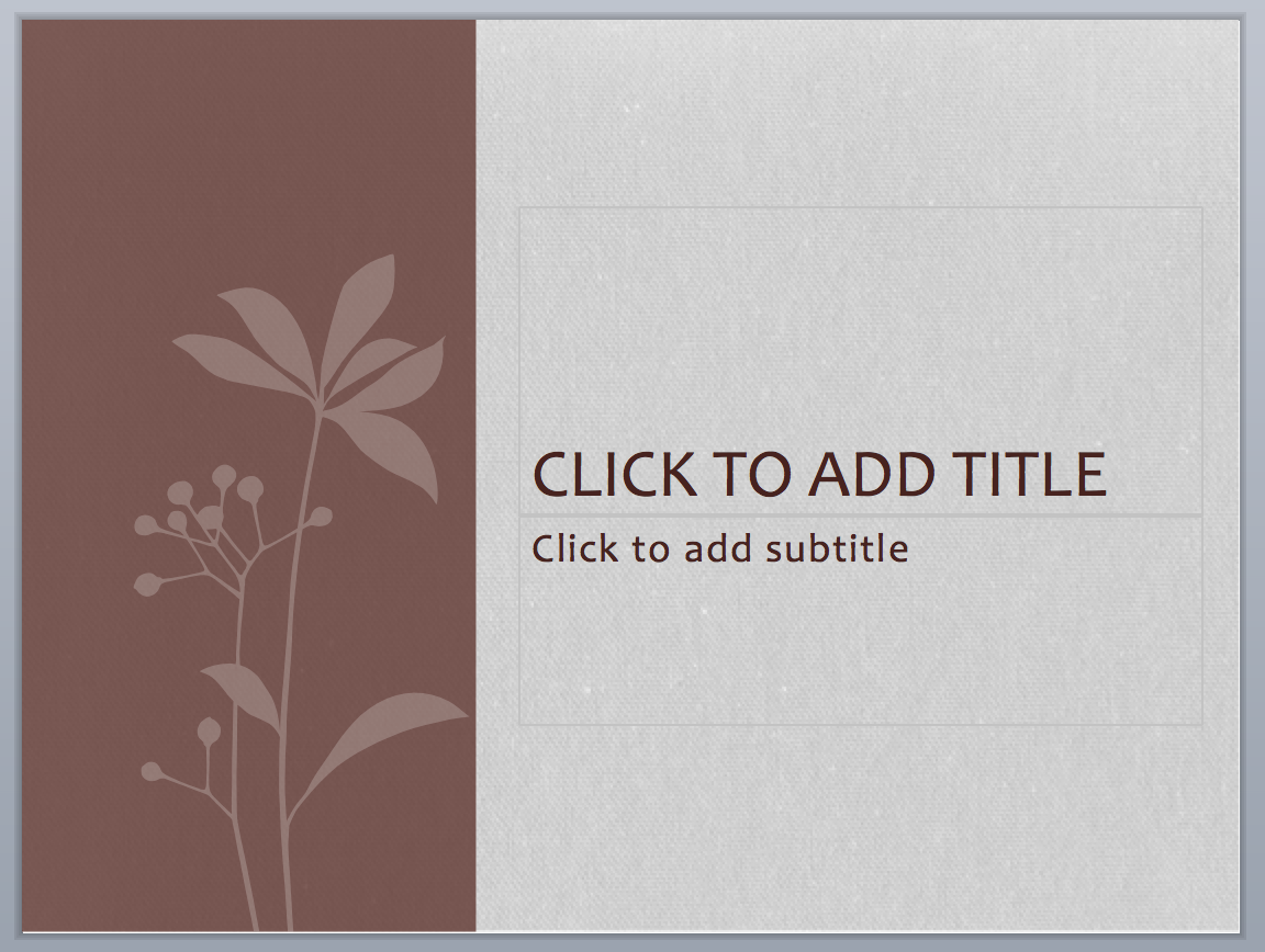
Use themes to your advantage. While I am generally in the habit of starting from a blank PowerPoint, Steve pointed out how useful the themes can be when creating an infographic. Pick one with a color scheme and style you like, but don’t worry about the exact look– you’re going to get rid of all the design elements anyway.
Here’s an example of the SOHO theme before and after the elements were stripped down and adjusted. You can keep taking away graphics to simplify the look (like I did here, leaving just the textured background), or keep the general style. Do this in the “Master Slides” function, since an infographic is typically just one slide.

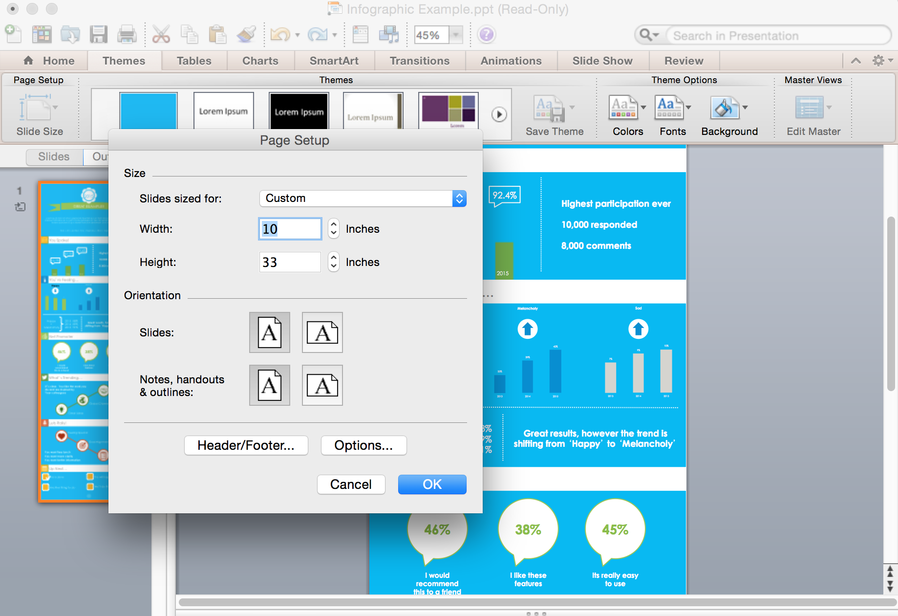
Resize the slides. In order to fit the need of your infographic. PowerPoint actually allows you to create custom sized slides, which is important for your freedom of design. See screenshot below for the slide size function. For the typical portrait infographic, I recommend a 1:3 or 1:4 ratio.
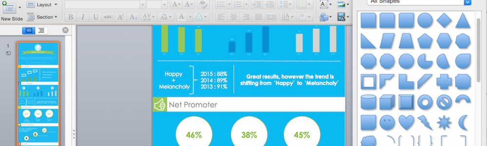
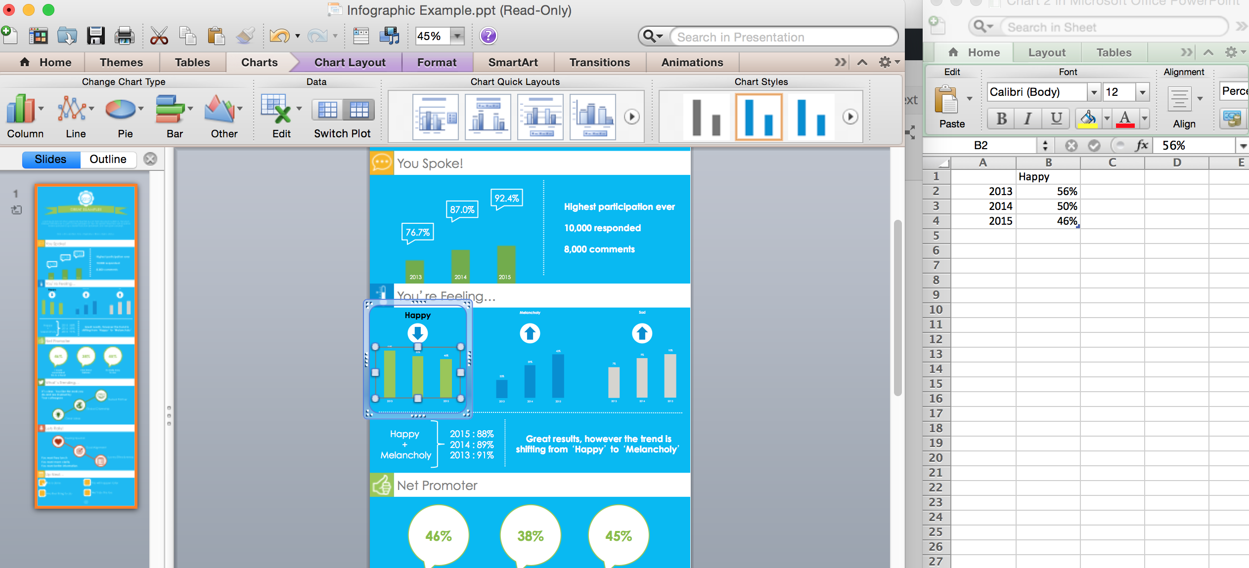
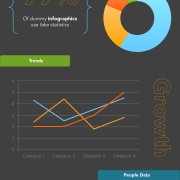
Use real datasets. Something I’d never considered being an advantage to PowerPoint vs the Adobe Creative Suite: you can input actual data instead of eyeballing charts or a complicated process of transferring data from an analytical program to a creative one. PowerPoint allows you to create charts and graphs within the program itself, and enter the data in Excel charts that are attached to the same file. This means all your data will be 100% accurately represented, without fuss.
Bonus for all you non-designers looking for an infographic without the hassle of hiring a creative team– PowerPoint comes with decent chart styles, based off the color scheme set. Even better, if you don’t like these styles, you can customize them as well.
Use the margins wisely. There are so many ways the margins in design programs can be used– color swatches, smart guides, or even saving objects to be used later. Steve cleverly used shapes in the margins of his PowerPoint in order to ensure that each section of the infographic was perfectly aligned and symmetrical. This can be done by just creating shapes, and moving them into the gray space next to the infographic. Similarly, if you use a company color palette, these margins are a great place to keep them close enough for the dropper tool, but out of the way of your design.
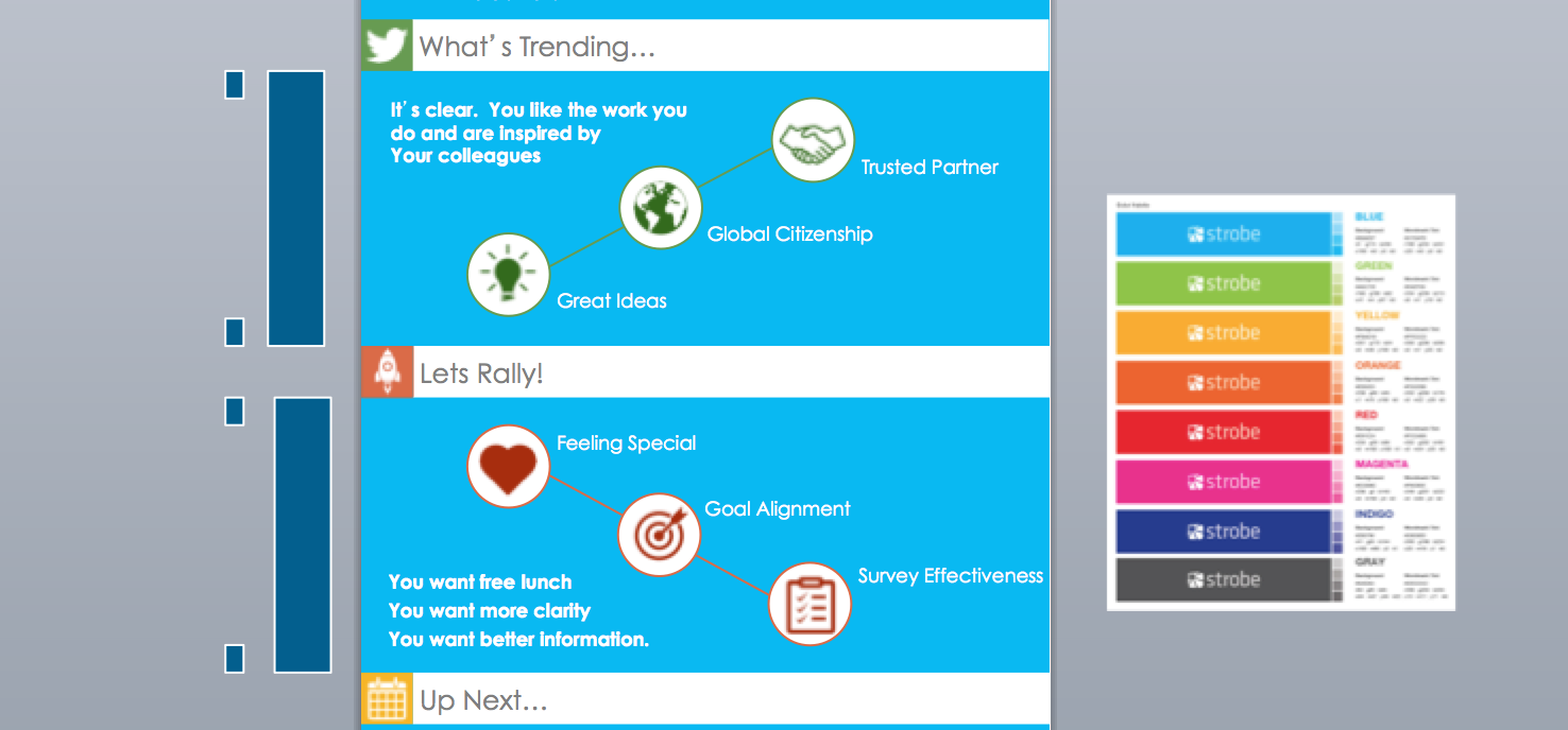
Be consistent with your use of icons. Nothing irks a designer more than the lack of consistency within a single project. Thick icons go with thick icons, thin icons go with thin icons, and please be consistent with the colors. The same way you would expect a continuous color scheme to be used throughout an infographic, icons should follow the same pattern. Steve collects a set of icons to be used together in various situations, and applies them as he sees fit. Start your own icon library with a consistent look and feel, and you’ll find a million places to use them throughout your design career.

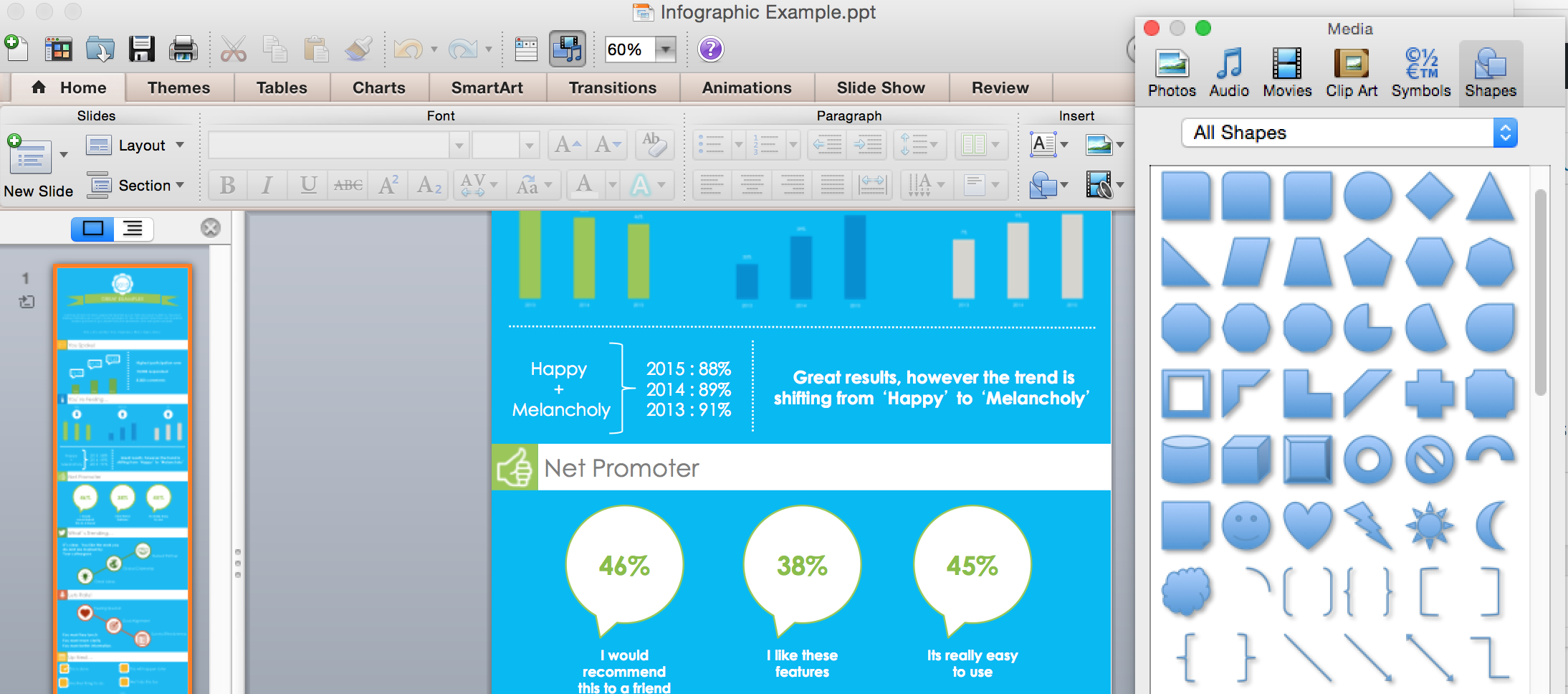
Don’t underestimate the power of the shapes tool. Use that shapes tool wisely, and it could look like you’re a professional illustrator. Stack the basics in order to create a more complex look. Get rid of the cliche PowerPoint shadow and outline default, and come up with something that fits your theme. These basic shapes are used everywhere in even the most professional infographics, you just have to have an eye for how to use them.
Browse around before you begin. Take some time to look through the work of other designers. Nothing inspires you more than an infographic that you really love yourself. It will give you great new ideas, and build your eye for design. There’s always something to learn from looking at other people’s work– especially with infographics. There are so many creative ways to display information, so don’t just gravitate to the classics!
And of course, have fun with it. Although these tips are in PowerPoint and may make the design process much faster than starting from scratch in Illustrator, don’t be frustrated if it takes you a while to find a look that you like. Design is about experimenting with things until you’re happy with the results.
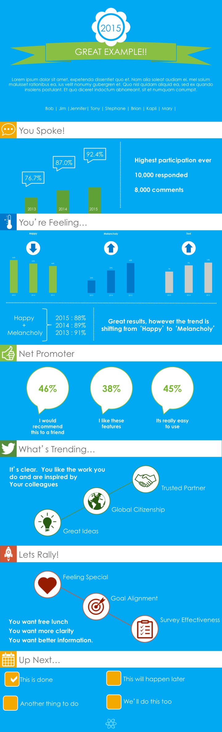
As cool as it is, Steve and I actually created an example infographic in PowerPoint to share with you. Download the file here to see how it was made yourself, and take a look below. Pretty good for PowerPoint doc, don’t you think?
Top Rated Products
-
 Doodle Genius
$1.99
Doodle Genius
$1.99 -
 Cottage Lake
$1.99
Cottage Lake
$1.99 -
 Ice Water
$1.99
Ice Water
$1.99 -
 Weatherman
$1.99
Weatherman
$1.99 -
 The Metropolitan
$1.99
The Metropolitan
$1.99